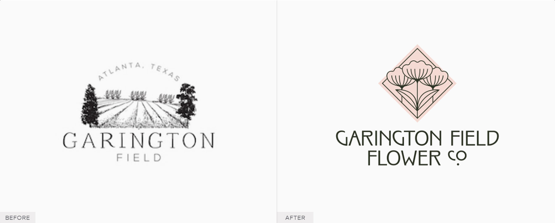
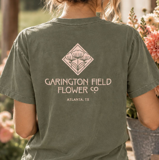
Garington Field Flower Co. is a specialty cut flower farm in Atlanta, Texas, offering seasonal, locally grown flowers. As a longtime passion grew into a business, they needed an identity that could take them from local markets to a future farmstand, you-pick field, and beyond. Their existing illustrated logo had also become difficult to use at smaller sizes, creating a need for a simpler, more versatile mark.
We created a brand that feels at home in the field while still feeling polished and distinctive. Inspired by the Arts & Crafts movement and Art Deco, the identity pairs vintage botanical character with clean, structured forms.
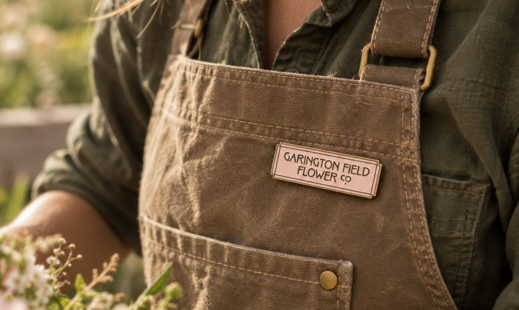
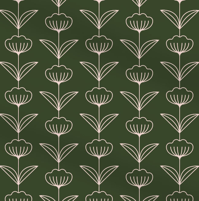
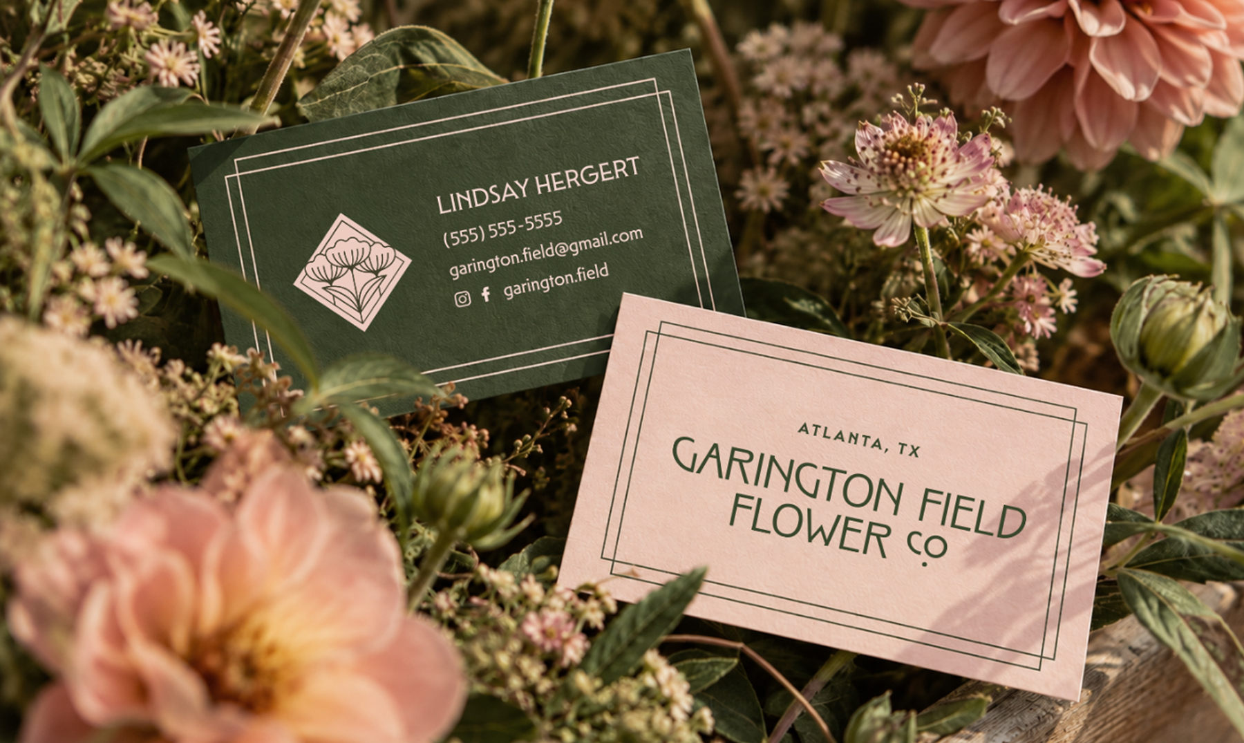
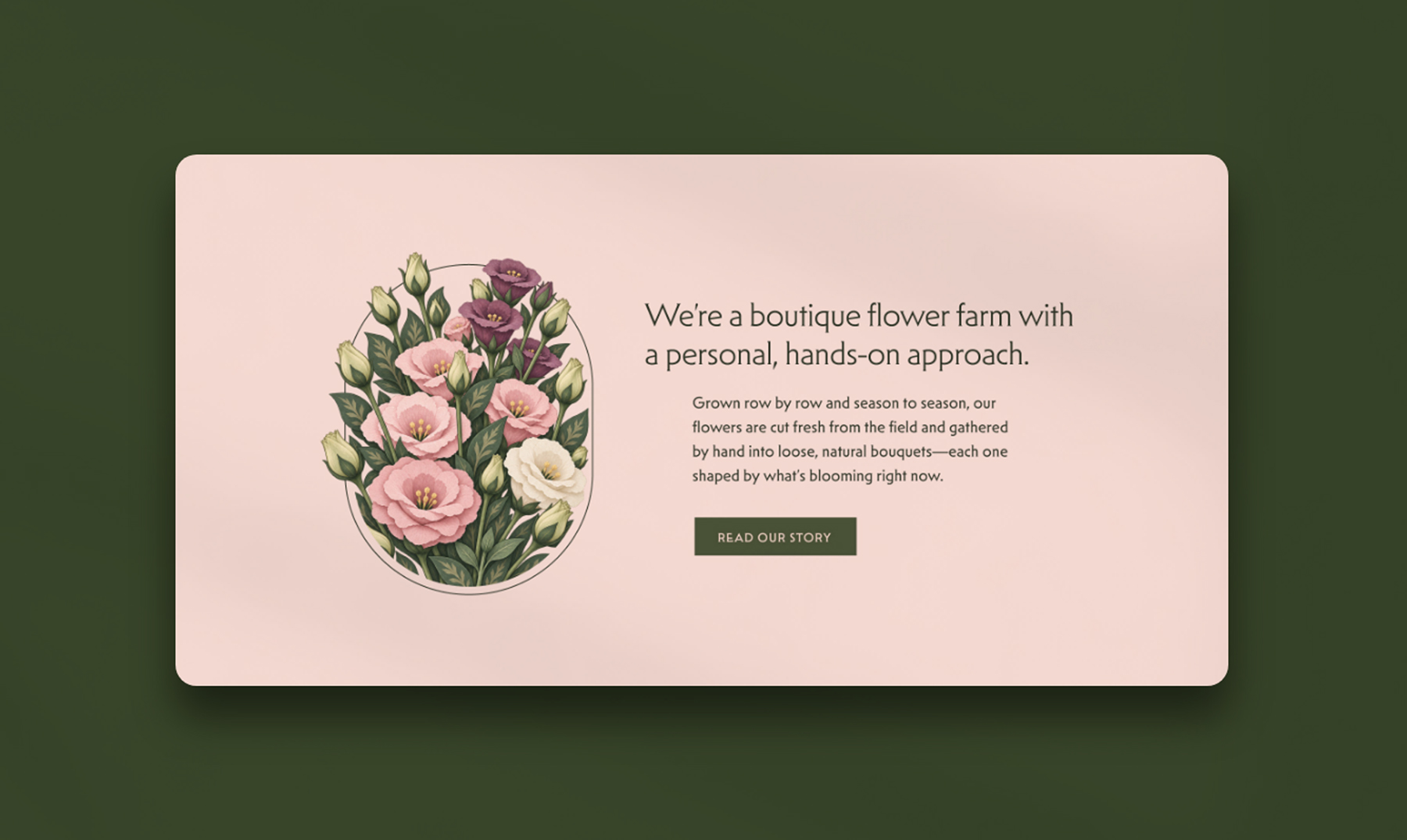
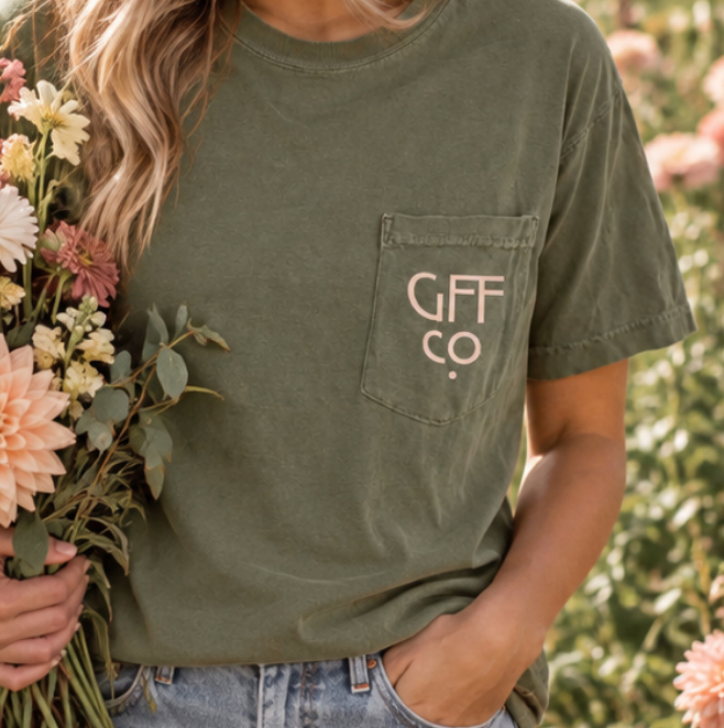
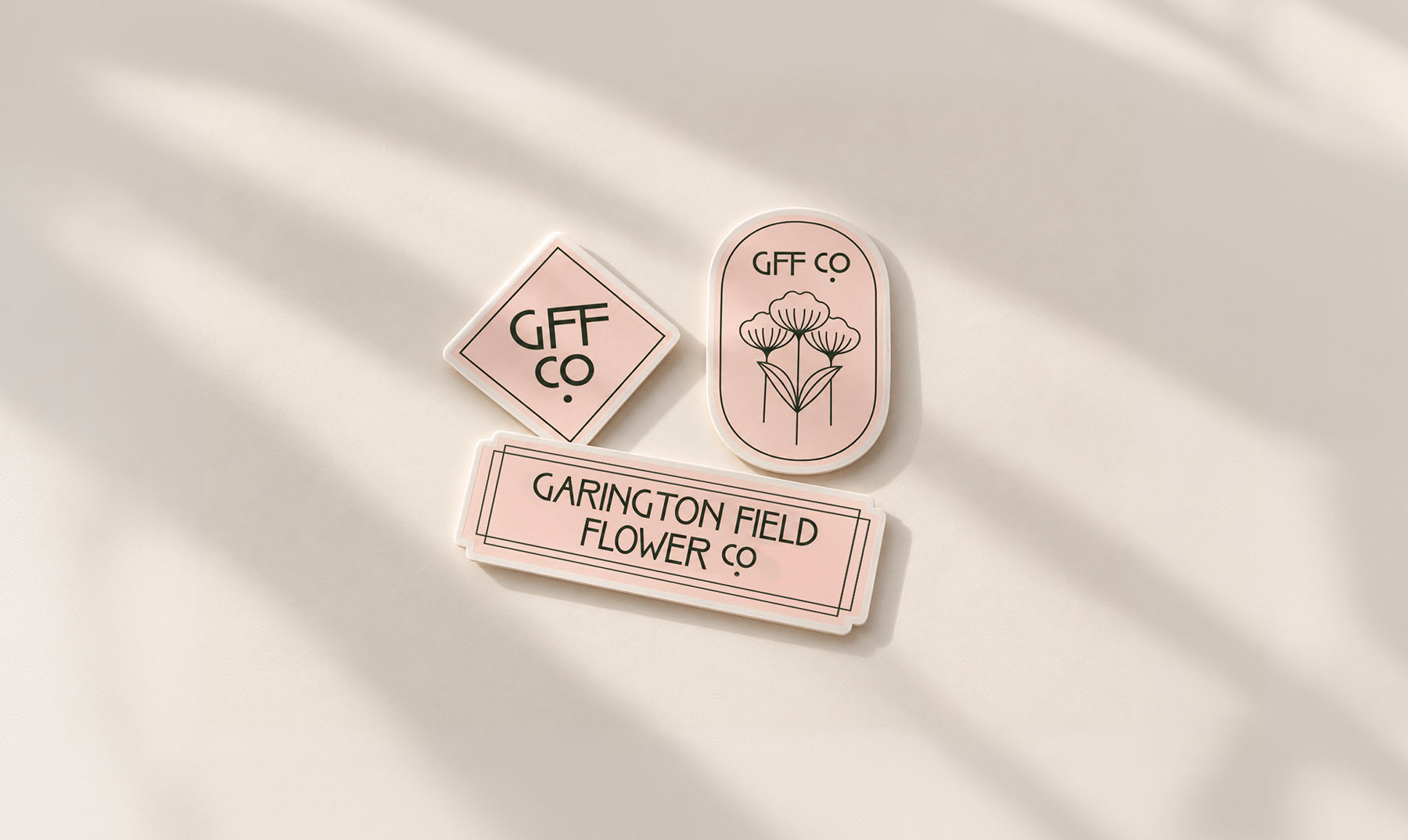
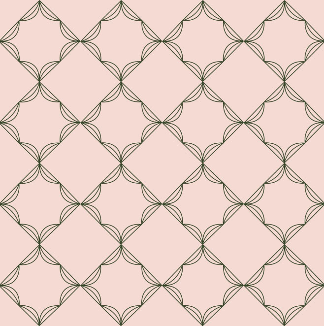
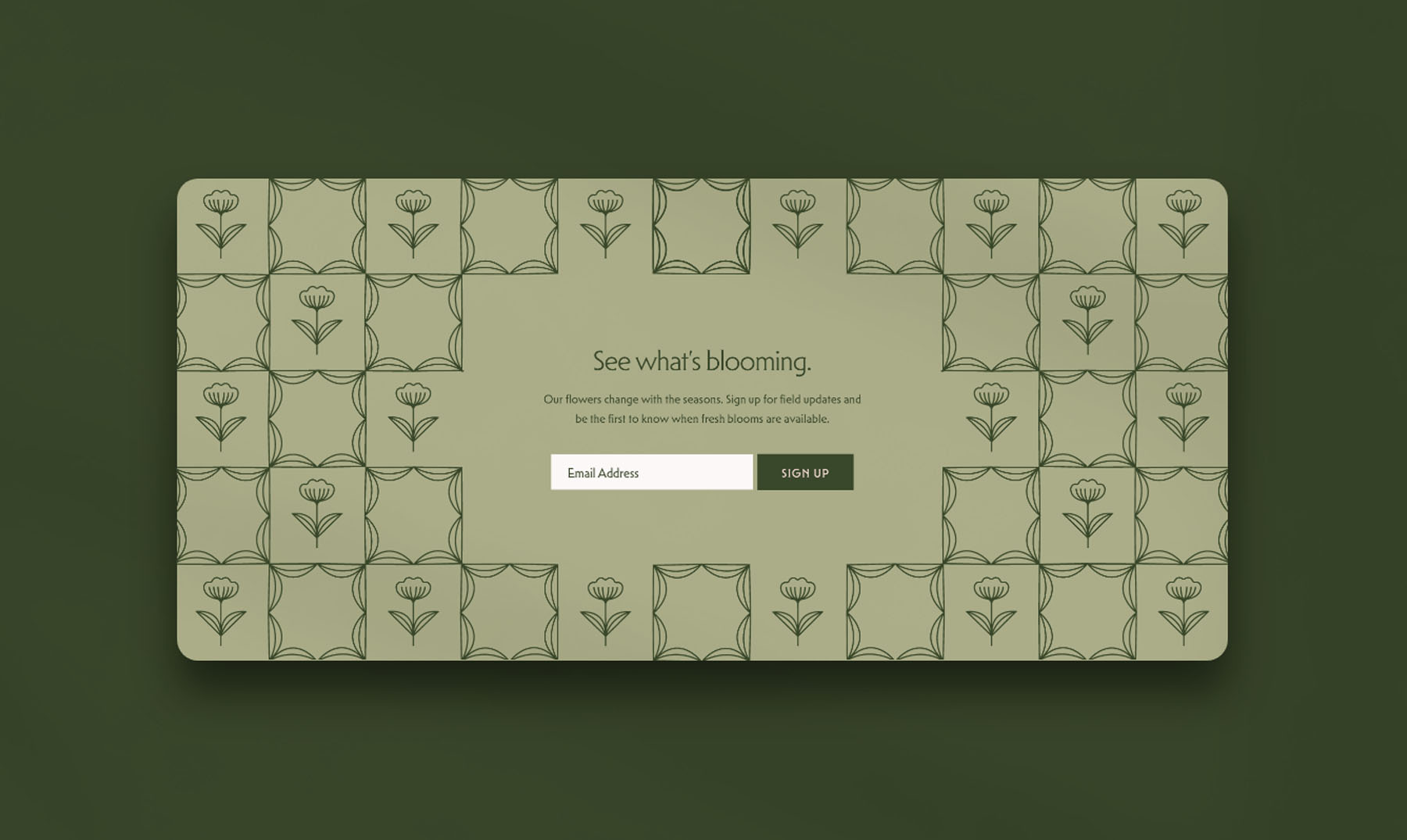
The new floral mark brings the focus more clearly to what Garington Field grows, supported by earthy greens and dusty pinks, vintage-inspired typography, botanical patterns, and a collection of seals that make the brand easy to carry across packaging, signage, apparel, and more.
Design Direction
Wild from the field. Thoughtful by design. The brand needed to feel established and consistent, with plenty of room to grow and change with the seasons.